
The Lion & The Fox by Andreas Neophytou
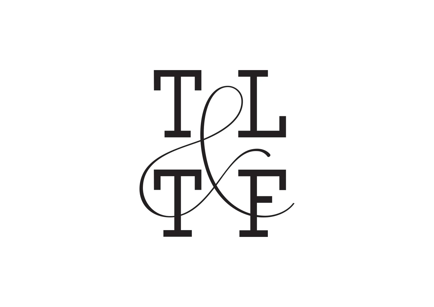
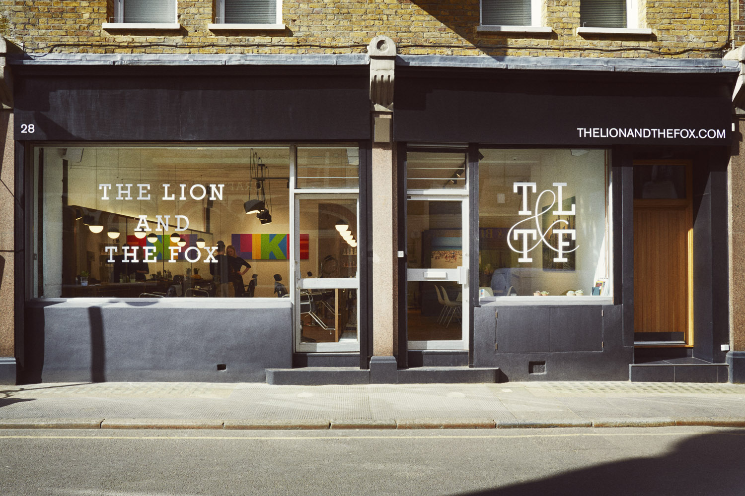
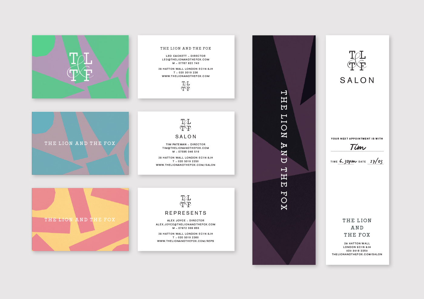
No, Andreas Neophytou hasn't re-written Aesop's comedy of manners, The Lion & The Fox. He has, however, created the graphic identity for a new salon and photography gallery named after the short story. The identity takes the form of a logotype and monogram – with each letter and a flowing ampersand crafted by Andreas himself – plus a patterned colour palette.
"Given that the salon's derives from one of Aesop’s fables, storytelling felt like a good place to start," explains Andreas of his approach. "I referenced the graphic design of book covers during the 50s, to create a strong aesthetic link to the design direction of the store interior which has a distinct mid-century influence," he continues.
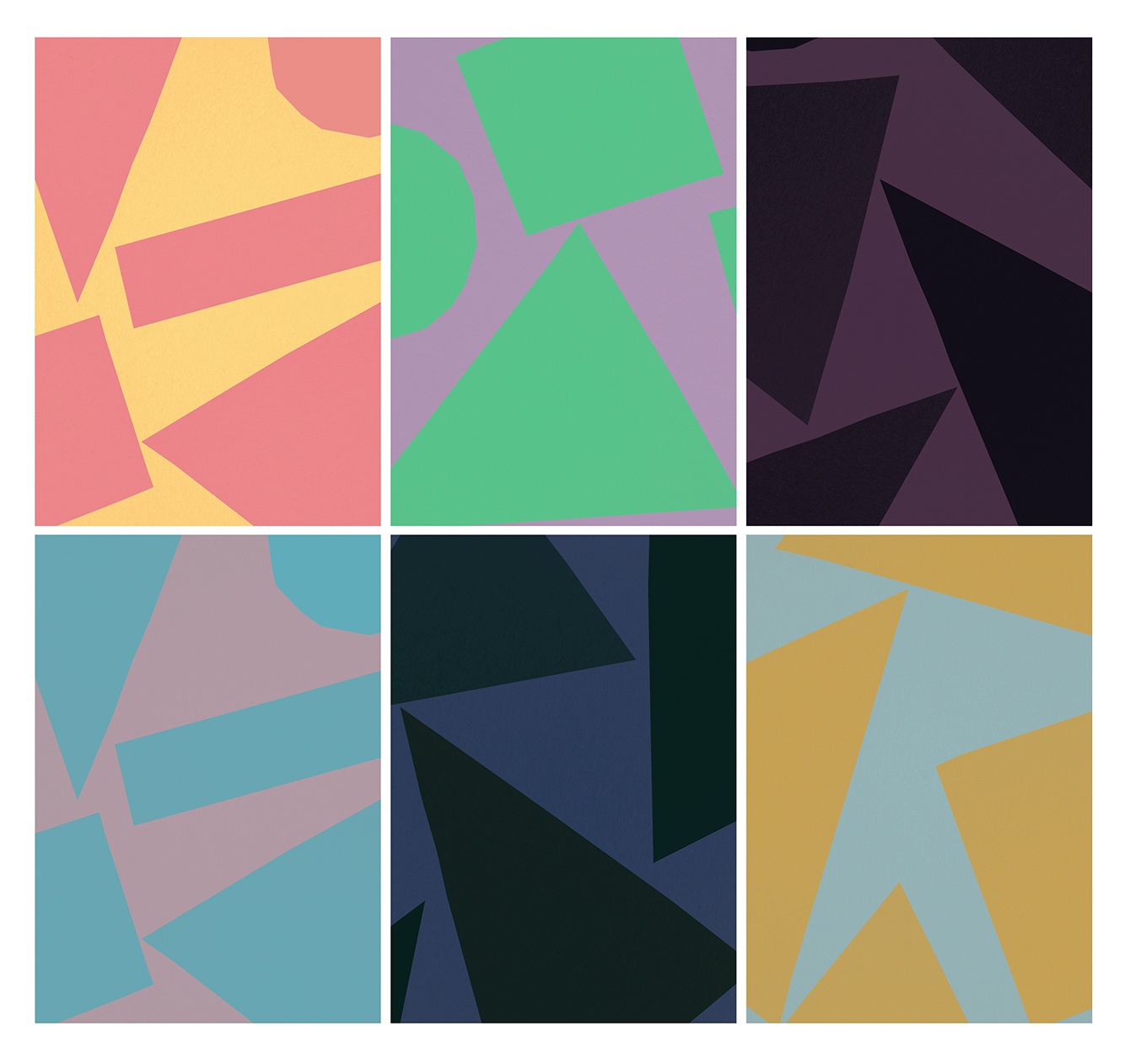
"This period of design can be characterised by loose hand-made graphics as popularised by legendary designers Paul Rand and Alvin Lustig. Playful shapes were often complimented with sharp, engineered typefaces such as slab serifs."

"I drew a thin, wavy ampersand to tie the four initials together. It’s not quite a hairline stroke but feels like a strand of hair. The slab serifs are from a font I designed, inspired by Roberto Aloi's Essempi series on contemporary Italian design that ran from the 1930s to the 1960s. The patterns were created by cutting simple shapes out of paper."
See more of Andreas' work on his updated portfolio here.
Find out more about The Lion & The Fox at thelionandthefox.com.